Saturday, May 29, 2010

Out of the box- Elements of Style CASE


Lisa Young made a card where she used only part of the flower image from Elements of Style and I thought it was lovely. Here is my CASE. The base card was embossed only in the front using the new Square lattice embossing folder from stampin up' summer mini catalogue.
I stamped the elements of style flower with basic black inkpad then colored it in using aqua painter using the lids of the inkpads to color in the flowers- I used lovely lilac, lavender and almost amethyst and the leaves were colored using gable green (ALL OF WHICH ARE RETIRING AS OF END OF NEXT MONTH!!!) and old olive classic inkpad. ( I love these blue purples so I am trying to decide how many refills and cardstock I need to reorder.....)
I then stamped one of the sentiment from Define your life set and then cut the image out using my cutter to square it up best I can. After I set up the corners then I used scissors to cut out the image outside the box. The whole thing is layered on a black CS smidgen bigger to set it off and added 3 small Ice circle rhinestone brad to finish it off.
I think I will try this white on white and see how it looks next! Thanks Lisa for the inspiration.
Lynda

Friday, May 28, 2010

Another Teacher GIft


This was a tough one- There is another teacher who loves bright bold colors and purple. Both of which are out of my comfort zone. I looked for over 6 months for a purple color paper that would be bold and I pray to God that she likes this.
The paper is from B* Bunny. It is glittery and thick and hard to cut around tight corners but it came out pretty I thought. The kids gave it thumbs up when I told them who it was for.
The ribbon is SU Rich Razzleberry polka dot ribbone backward which matched the paper perfect with another Matha S Clear Rhinestone in the center.

I tied kiwi ribbon (retired SU) and more rich Razzleberry ribbon and put extra crystals in the center of the flowers on the top of the lid to add some extra bling.

This is a detail of the ribbon accent.
Now I just have to fill it with bold bright cards I hope she will like.
Think of your teachers and make something special for them- I found out that one of the kindergarten teachers I have met and thought was great got the pink slip and may not be coming back next year...sigh-
Of all the things our government should be spending money on, the schools should be our priority. The children we educate today will be all our futures. The earth we save today will be all our home. Don't you think?
My two cents.
Lynda


Wednesday, May 26, 2010

Black Magic Awash with Flowers

The Technique Lover's Challenge on Splitcoast this week was to try Black magic- using white craft ink onto black or some other dark cardstock you stamp some solid image, heat set it then color it in- I used watercolor pencils here but you could use pure color pencils as well. After I colored it in with variety of colors, I used the signo gel pen to highlight the area. to make it pop some. The sentiment was from watercolor trio set. I punched out an oval and used the negative as an outline to go around the sentiment. I cut a slit on the sides of the sentiment to slide in a 1/4 inch grosgrain ribbon and a real easy card- seriously, it took less than 10 minutes to make this card, if you can believe it- no layering, nothing. Have a try at it!


***********

stampset: Awash with Flowers 117062 $39.95 woodmounted / 120549 $27.95 clearmounted (available in new catalogue in July)
Watercolor trio 117050 $22.95 woodmounted / 120084 $16.95 clearmounted
paper: real red 102482 $5.50
Basic blac 102851 $7.50
ink: White craft ink pad 101731 $7.50
Watercolor pencils 101879 $19.95
accessories: Uni-ballSigno Gel Pen 105021 $3.95
large oval punch 107305 $15.95
Real red 1/4 Inch grosgrain 109034 $4.95 for 15 yards
Hobby Blade and refill 102449 $4.50.


Tuesday, May 25, 2010

Gift Cards Set for Preschool Teacher


My preschool teacher sent me a thank you card and I thought she would like these. They are made with premade textured cards in variety of colors.
The images are from Stampend*us and I used the SU watercolor paper and colored it in with variety of markers.
After I mounted the watercolor paper I went around it with little strips of gold fold stickers ( from Starfoil? I could not see a clear label on the product to tell you who it is from but it comes in sheets with tons of little strips and borders in the center.) I thought it looked much more professional than using gold pen or something else.


I thought they looked pretty. I hope she does too.
Thanks for looking!
Lynda


Monday, May 24, 2010

Teacher Gift


I have a particularly wonderful preschool teacher for my boys and we have been with her for almost 5 years and I wanted to make her a gift that gave of my time to show my appreciation- I love making a gift card set so I made this for her. It is paper from MyM*nd's Eye that I have been hoarding just for this purpose.
I made a template and cut the paper to fit the handle and adhered it using Xyr*n adhesive. Decorated the handle with some crystal and ribbon

The paper is broken up with a bashful blue satin ribbon and decorated with a bling from Martha S.


I made several dividers with tabs for celebrate, birthday and thank you and laminated them to make sure they will be sturdy.
The boys signed their names on the bottom with sharpie and I stamped a sentiment from PTI *nk using StazOn.
The boys told me she likes "pink" but I am not sure - Hope she likes this one- she's getting it later this week.
TeeHee,
Lynda

Sunday, May 23, 2010

Decor Stenciled Card


This is another variation on the stencil class I did earlier this month with the colors from the color challege from Splitcoast CC271 using Razzleberry, Dusty durango and so saffron with a neutral and extra using stencils- I thought this fit the bill perfect


I hope you all know that Stampin Up has a whole line of stencils for home decor but they also have small ones that I just adore that I use for cardmaking of course. I am using the Mostly Vintage stencil from the summer mini here- it comes in a set of 2 and it makes such easy card.
.


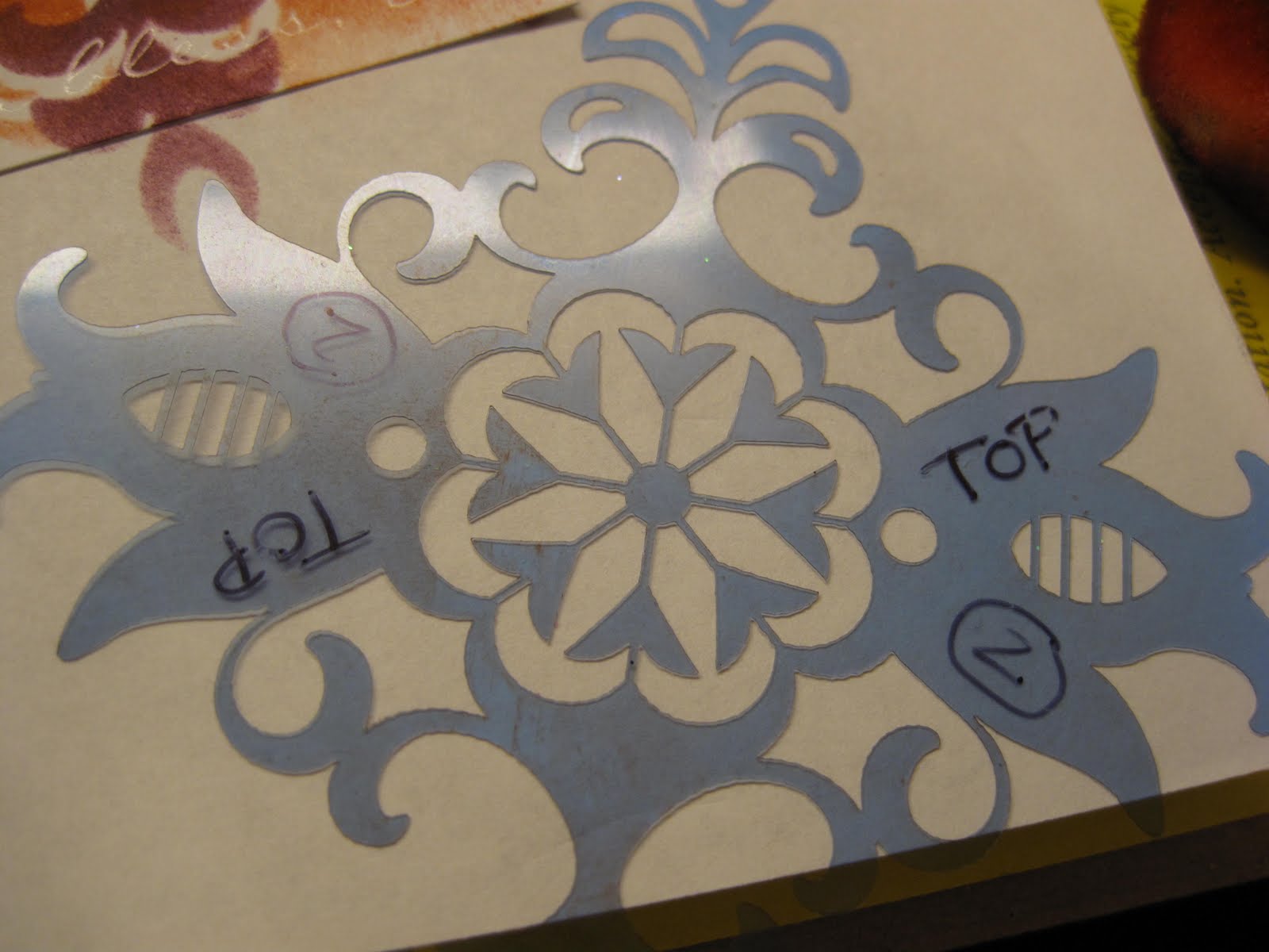
I like to store my stencils in the clear mount cases between tissue paper that it comes with so that they stay flat and undistorted. One of my mostly vintage stencil does not fit inside so I have to keep that in a folder with a chip board that it came with but I likethis method- You think SU will come out with a larger version of this box for stencil storage?
I wrote "top" with my sharpie so I would know which side had the ink on it as I stenciled so the next card would not get messed up- After I was done with the class I just rinse it off under the faucet and good as new!

I wanted to add a little extra in the corner so I took the second stencil and used the razzleberry ink to sponge onto the base razzleberry card.


This is what it looks like after you stencil.


I then took a piece of Presto Patterns specialty paper to stencil the dusty durango as shown. The words just pop up and is so pretty. I just smudged the edges to soften it up a bit.


This is what it looks like after the first stencil.


Then the second stencil is put on top but slightly off center and sponged again.


And this is the final card, with a clear rhinestone brad in the center, layered in so saffron, dusty durango onto a razzleberry cs. The sentiment is stamped in razzleberry and punched out with a large oval and attached using a dimensional.

My veteran stampers and beginners all thought this was fun to do- I hope you do too.
Lynda


***********
stampset: Watercolor trio 117050 $22.95 woodmounted / 120084 $16.95 clearmoun
paper: Presto Patterns DSP $11.95 for 12 12x12" sheets
so saffron 105118 $5.50
Dusty Durango 115321 $5.50
Rich Razzleberry 115316 $5.50
ink: Dusty Durango classic ink pad 115654 $5.95
Rich Razzleberry 115658 $5.95
accessories: Mostly Vintage Decor Stencils 118877 $9.95
sponge 101610 $3.50 for pack of three
large oval punch 107305 $15.95
Clear rhinestone brads 113144 $10.95 for 84 brads in 3 sizes.


Saturday, May 22, 2010

Cloud Stenciling with Tropical party


This is a variation on the card we made for my workshop earlier this month to show stenciling. The clouds are stenciled using the a scallop circle punched out- using the sponge and a very light hand- continually moving the scallop to make the cloud scene. Here I used the tempting turquoise inkpad because that was the color I used on the base card- picked up from the colors in the Island Oasis Designer paper.


The palm tree is stamped twice with old olive on top then the bottom covered with a ripped piece of so saffron with some gold glitter on it to simulate sand. I love this Designer paper and wish they had more of this pattern which is so Gorgeous!

The sentiment is stamped in black from Upsy daisy set.


This is what the sky would look like- it does take a bit of practice but really easy once you get the hang of it. A light hand is always better- it is easiet to add color than to remove it-
moving it around randomly makes it look best.

The drink was stamped onto white twice and punched out once and umbrella and coconut cut out and mounted with dimensionals-edge distress with pumpkin to add a little extra dimension.


Lynda


***********

stampset: Upsy Daisy 111710 $18.95
Tropical Party 118515 $17.95 woodmounted / 120081 $13.95 clearmount
paper: Whisper White 100730 $7.50 for 40 sheets
Island Oasis Designer Series paper 117173 $9.95
tempting turquoise 102067 $ 5.50
so saffron 105118 $ 5.50
ink: yoyo yellow marker 100050 $3.25
red marker 100052 $3.25
pumpkin marker 105115 $3.25
tempting turquoise 100058 $3.25
tempting turquoise classic inkpad 100814 $5.95
basic black pad 101179 $5.95
accessories: sponge 101610 $3.50 for pack of three whole-I cut mine into quarters
fine galaxy glitter 1014286 $13.95 for pack of 5 colors
2 way glue pen 100425 $3.50
1 3/4 cicle punch 112004 15.95
scalllop punch 109043 $15.95

Friday, May 21, 2010

Watercolor Trio thank you


I am playing with the one layer card idea still and this stampset really makes it happen easily-
I took a cardstock and made a window template by
xxxxxxxxxxxxxxxx cutting out a rectangle and used it to sponge some bashful blue ink onto another white cardstock to create a subtle background frame. I stamped the flower after coloring it with old olive and regal rose markers- then the sentiment in basic black.
Added a little dazzling diamond glitter wtih 2 way glue pen.
Really easy thank you card.
Lynda
***********
stampset: Watercolor trio 117050 $22.95 woodmounted / 120084 $16.95 clearmount
paper: Whisper White 100730 $7.50 for 40 sheets
ink: old olive marker 100079 $3.25
regal rose marker 105108 $3.25
bashful blue classic inkpad 105209 $5.95
basic black pad 101179 $5.95
accessories: sponge 101610 $3.50 for pack of three whole-I cut mine into quarters
dazzling diamonds glitter 102023 $4.50
2 way glue pen 100425 $3.50


Monday, May 17, 2010

Elements of Style glittered


This is hard to see with the glitter but it is quite pretty. The base is rose red with white CS corner rounded on top. Stamped the edge with mustard first and french script in rose red and mustard - sort of dabbed onto the rubber but ONLY AROUND THE EDGE so it would not stamp the words in the center.
Flowers were stamped in black and heat set, colored with watercolor crayons and watercolor brush in melon, rose red and olive and artichoke then used 2 way glue to apply the glitter. The whole thing is edge sponged to distress it and to soften the edges.
For you stamped in black and edge sponged with mustard, punched with circle punches and added a clear rhinestone in the center for that extra bling. Added the mustard grosgrain looping it around and taping it under on the left to create what I thought looked like one of those seal things. Thanks for looking!


Sunday, May 16, 2010

Elements of Style Fun


Can you tell I am in love with this set? Not sure about the bird in there but the rest of the pack is just perfect for coloring in, monochromatic stamping, just Love it!
This card had a base of melon mambo and white then black layers. The middle was another whisper white CS stamped with black then heat set so I could water color it and colored with melon, razzleberrry, and olive. I stamped the dots from extreme elemets in mustard and sponged the edge in mustard and melon and a tiny amount of black even in the corners (be gentle with black though- the reason this is this size is that I chopped off a bunchh off the edge where I got too much black on it!)

The sentiment was stamped in black with image in mustard, and punched out with large oval punch- YES I SAID LARGE- the small one would not fit the words and then sponged some with melon again to distress it. I then punched another melon CS with large oval as well, split it in halg across the middle to raise it up and down to create a frame.
I tried to make a wave with the melon polka dot ribbon turned over but the glue would not stay and kept ppopping up so I had to take out my dreaded needle and thread to stitch it in place. I poked holes with my piercer first as my thumbs are in bad shape with getting old type arthritis and all and holding a needle is not so fun, then put a clear rhinestone brad for an accent before I mounted the whole thing on the melon mambo base card.


I don't like having dark cardstock to write on inside so I put a plain whisper white CS corner rounded on the inside with some little strips of left over that I trimmed off the front panel- remember I cut it off for too much black on some of the sections?- Waste not want not....
It finishes off the inside to sort of match the front with nothing doing.
I hope for you all this week something you can smile about each and every day.
Lynda

Saturday, May 15, 2010

Watercolor Trio variation


I think this one suits me better. The center image is stamped using markers to color the image on white with so saffron, olive and rose red. Sentiment is stamped in black. Mount the whole thing on olive and pierce some holes in the corner and add some faux stitch using the white gel pen. Versamark stamp the other images on saffron and rose red and mount on white CS with faux stitching vertically as shown and add the accent piece and Bob's your uncle!
I am spending my weekend stuck in a conference room learning about the dismal future of medicine.
There is a song on my play list called How You Live- it's the last song on my short list- it tells you to live your life without regret - listen to it and live your weekend to it fullest for me!
Lynda

Friday, May 14, 2010

Watercolor Trio experiment


I really like this watercolor trio set- I played around with the set using crayons and here I used the markers, so saffron, rose red and old olive to color the flowers for a sharper image. The sentiment is stamped in olive using the pad, the ink on "kind" lifted off with blender pen and reinked with rose red marker. I layered another white stamped on top for an accent.
The corners snipped with a scallop punch and little pink pearls added in the corners. The little flower was an extra I had left over that I cut out to balance the card. I'm not sure how I am liking this card. I'll keep playing and see what I can come up with.


The inside of the card I double and triple stamped to get that blurry watercolor look- to tell you the truth I think I like the inside more than the outside.... hrumft! ( how do you spell that disgruntled noise? )

Thursday, May 13, 2010

Watercolor Trio One layer card


It is a real struggle for me to create simple one layer card- God knows I keep trying but it always looks like something is missing and I have to layer it with something else and then - not one layer any more. Getting that clean, simple but finished look is much more difficult than it looks.
I think this is my most successful one layer card so far- the new Watercolor trio from the summer mini makes it possible. I used watercolor crayons directly to rubber and spritzed it lightly with water- then stamped it a couple of times, respritzing between each stamping. It looks like the softest watercolor and it was really easy. Stamped the sentiment in black - Are these sentiment not the most gorgeous? I love how they mixed up the fonts- just perfect! Added some rhinestone crystals - line it up using the big holes using the mat pack- and voila- one layer card at last!

Wednesday, May 12, 2010

SCS CAS66 challenge


This is probably one of my favorite GO TO sketches of all times. It is such a simple layout but so many different ways you can make it. So here is my version using the new Punched posies set from SU summer mini for the flower.
Base card is melon mambo. Scallop edge punch in gable green (retiring, sigh!) and another 1 inch strip embossed with perfect pollka dot. The flower is another recently coveted purchase -flower border punch from EK success- just LOVE IT! Stamped the flower and sentiment for messages for mother from the spring mini- I think now also gone- in white craft- sentiment heat embossed in white. The flower is punched the extra large fancy flower punch with flower images from the punched posies set in melon and white. Layer the images using dimensionals and finish off with a little rhinestone in the center. Literally took me 10minutes to make.
Happy Hump Day!
Lynda

Tuesday, May 11, 2010

Elements of Style with Pin- SCS WT269 challenge


I was just playing with this set and found a challenge to use a pin on the card on SCS so here it is. Base card is white with layer of razzleberry- edge punched with eyelet punch. I took a white CS used versamark to emboss the image on the left and sentiment in clear, then rubbed soft suede using a ponge to make it pop. I then stamped the flower in black and colored it in using razzleberry, melon and olive using the watercolor brush. I tied a knot in the razzleberry ribbon- turned over from the polka dot side- took a pin from the pretties kit wtih pearls and bead and all done!
Enjoy!
Lynda

Wednesday, May 5, 2010

SCS challenge CAS65, TLC271 and CC249


Is it May already? Mother's Day is just around the corner and SCS put a couple of challenges that I rolled into one card.
The base card is whisper white. The Sweet Pea Image from Papertr*y is stamped in black on Vellum Cardstock in the front, turned over and colored in with Cameo Coral and Gable Green SU Markers using the blender pen to soften - on vellum it takes longer to dry so easier to do then on plain cardstock.
Then I took the vellum and used Long Oval die from Spellb*nders to impress the oval without cutting then used my Sc*repad to score the lines evey 1/2 inch on a diagonal then used my stampin up brass template and an empressor to make the little polka dots in the center. The whole thing was mounted using Xyr*n to get a clean adhesion to the cardstock ( I find even the vellum tape still sometimes show and it bugs me) The TLC271 challenge was to use vellum with some embossing technique.
The sentiment is from Women of Life from PTI as well on white in Lovely Lilac mounted on same color CS (CC249 challenge was to use cameo, liliac and gable green- all retiring, SIGH!
The sentiment is mounted using dimensionals and glue dots to create the banner effect.
Button is from SU Button Latte collection with a gable green cardstock leaf I freehand cut.
So here is my clean and simple Mother's day card for CAS65.
Enjoy!
Lynda

Tuesday, May 4, 2010

Sweet Peas


This is definitely better. Someone needs to teach me how to make a one layer card because I can't seem to be able to do it, oh well.

Sweet Peas


I have been working on a little project for my twins. Their preschool is run by a wonderful woman who has an organic garden that the children participate in caring for that has berries, flowers and vegetables they use to feed their rabbit. I came home yesterday and found this little bouquet that Dylan made for me with sweet peas and daisies and it just made my day.
Funny thing is that I had been working on some cards for the teacher and had ordered the flower of the month Sweet Pea from PTI that I just received. I am not so familiar with sweet pea but knew she loved it so I will use these as color inspirations in the future. But this is what I had made. A very simple one layer card using the 110 heavy duty PTI cardstock wtih sentiment from the women of life set. It was colored with Cop*cs in the BV tones.
I just have to figure out how to resolve the issue with the color bleeding through the back on a one layer card- I may have to change it to 2 layers to accomodate this- yes, yes, me and my obsession for clean cards......
seriously, take time to smell the flowers- there are many lovely blooms out there.
My favorite lily of the valley are in bloom right now outside my back door.......
Lynda

Saturday, May 1, 2010

Sumi-e card


I just went gaga over these Suiboku clear stamps from Kodomo *nc. I loved the simple hand drawn look of the design and was able to get some before they ran out and have been dying to use them but did not have much opportunity. I am in the midst of making my annual thank you gifts for my children's teachers and one of them seems to like simple serene type of cards so I am making some variations for her.
This came out of SCS challenge IC229 from Green Rainbow and saw some asian cards that inspired me to get my butt in gear and make some of these. Inspiration here at http://www.greenrainbowshop.com/mm5/merchant.mvc?Screen=CTGY&Store_Code=GreenRainbowShop&Category_Code=eco-home_stationary
The image is stamped on a Fabriano paper- that I have been hoarding- with its slightly rough hewn texture is perfect for that homemade look- with tuxedo black mement* inkpad and the cricket colored in with river rock. The seal is in ridinghood red. The paper is torn and not cut to maintain the handmade look of the paper- mounted on river rock base card with dimensionals for an ultimate in simplicity card. You could use watercolor paper instead.
Lynda
Quote of the day:
"Courage is the power to let go of the familiar. "
Raymond Lindquist