Saturday, July 31, 2010

Owl Week- Pirate Owl


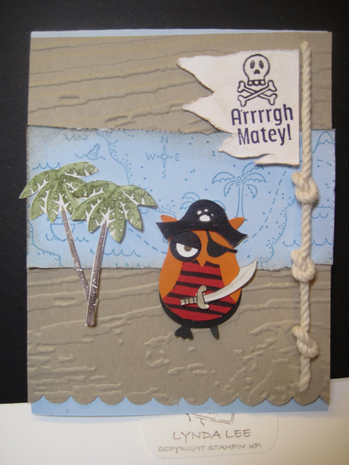
As Stampin Up demonstrator you get to preview and preorder items from upcoming brochures- the new holiday mini has a set called Season of Hugs for the build a bear that was just perfect for the idea I had for the owl pirate. The proportion for the sword was just perfect don't you think? I also realized after making the graduate card that the sock monkey accessories has a cap that would have perfect. It can all be mixed and matched like Mr Potato head! You gotta Love It!
I embossed crumbcake basecard using the Tim Holtz woodgrain EF from sizzix (I thought it looked like waves and foam ) and punched the lower border with the scallop border. I used Matey map - retired jumbo wheel from SU- onto bliss blue CS using marina mist. The palm trees are from Tropical Party set- inked with chocolate chip, olive and wasabi on white and cut out. The sentiment and the skull and crossbones was from Pirate Billy from Pink Cat Studi*s onto a white CS that I free cut and distressed.
The Owl was punched in pumpkin pie - lopped off the feet, then again in black then lopped off the top to create the pants. I made the peg leg by cutting off the toes to the left and right and keeping just the center to create the peg. The belly was punched in red and Crushed concord stripe added with the marker. I added the twine rope and knotted it 3 times and ran it through to the back and opened up the fibers to tack it down without adding so much bulk (this was for the SCS challenge F4A23 Sideswiped) and I though it added a fun nautical touch.
I have a few more owl creations for you all to see- one that is now my new favorite so stop by and check it out.

Friday, July 30, 2010

Owl Week- the graduate

When I was playing around with the owl punch, I realized that the larger eye circle looked like glasses when I made it in black so I had to make a graduate out of him/her. The color challenge on Splitcoast this week was Pear Pizazz, Daffodil and crushed concord CC281 and the sketch challenge was http://www.splitcoaststampers.com/forums/card-sketches-f41/sketch-challenge-291-07-28-10-a-t500336.html The base is Crushed concord, with pear pizazz and old DSP from Stampin Up Saleabration years ago ( I am really trying to use up my DSP's that I have been hoarding for SO LONG!) but it was more saffron than daffodil, so I punched some flowers in daffodil- using non SU punch from long ago as well- with purple stickles in the center for some sparkle. The hat and the glasses handle were free hand cut. The A+ is from First Day set from the mini adn the congratulations from Perfect Punches from the new catalogue stamped in crushed concord on pear and daffodil CS and cut out or punched out.

I spent what seemed like a long time making that graduation cap, strung a purple waxed linen thread with a black brad and stuck a dimensional on it and in the middle of making my owl, it disappeared. Now I had an occasion when I was making some punch animals, a crucial piece I had cut out disappear, had to make a new piece, to find out later that it was stuck to my bottom of my pants! So I danced around like a dog chasing its tail, dropped on the floor to see if it fell, dragged through my garbage to see if I threw it out-


only to find it stuck on my mono adhesive handle when I flipped it over to glue something- ever have this happen to you?

I made me cackle at my own stupidity. Hope your day goes better than mine...... if this is any indication as to how it is going to go.


Lynda


Hello Kitty Birthday


My life is filled with boys and all boy paraphenalia- legos, cars, building blocks. Still, when I went on line and saw that Hello Kitty Sizzix dies were on sale, I bought them. Why? I don't know... I just WANTED them. I thought maybe some day I will have granddaughters- when? well, considering my kids are still under 10 I think I got a long time to wait. But I found out that one of my friends' little girls is celebrating her birthday this week so I revelled in the chance to make a card with this die. The base card is pirouette pink, the blue DSP is retired SU from Sale-a bration a while back, the clouds are die cut from MFT cloud trio die with whisper white, the largest is stamped with sentiment from On your Birthday set in basic black. The DSP for the dress is Sending Love- retired with melon mambo, celery and so saffron DSPballoons.
If your birthday is close, hope you have a good one!
Lynda

Thursday, July 29, 2010

Owl Week- Christmas in July- the Santa


This wraps up my owl week of cards. I was dreaming of the owl santa- I tried to use the sock monkey santa hat but it was a tad big so had to cut it down a bit and used the white CS with 2 way glue pen to add dazzling diamond to add a bit a sparkle which really enhance the santa. The eyes are soft suede, the buckle, brushed silver. The sack is the owl punched in whisper white turned upside down and trimmed down to make the sack look more round.

The chimney is real red, scored with empressor to create brick lines. The roof is chocolate chip with circles cut in half to add as tiles. The DSP is retired SU Christmas Cocoa with Four the Holidays sentiment in Grey for a subtle look. The owl is mounted with dimensionals to make it pop a bit.

I had so many sketches I played with this week using the owl punch but these were all I had time to finish- hope you enjoyed it!


Lynda


Wednesday, July 28, 2010

Owl Week- Witch with a broom


I put away all my halloween stamps and can't seem to be able to find them in my mountain of a mess room but was able to dig this one out. It's an old Stampin up set called Web Wishes. Stamped the spiderweb and sentiment on a retired SU DSP Cast a Spell in black. I used little black crystals and used black marker pen to create little spiders.

The owls was punched in concord grape with black shoes and hat free cut. Belly and hat band from same DSP. Eyes in pumpkin pie and broom is a piece of owl belly in pumpkin pie shred cut abd wrapped around a piece of suede CS.
The whole thing is mounted onto the concord grape cardstock - although it looks more blue here, oh well.

Wait, does Halloween come before Thanksgiving? Oh well....

Stay tuned for tomorrow's owl reveal!

Lynda


Tuesday, July 27, 2010

Owl Week- the pilgrims


This is my favorite from this week. The owls are punched in chocolate chip. I cut off the ears on one of them, layered the bellys punched in soft suede, pumpkin pie, chocolate chip to make the feathers. The eyelids and the belly is pumpkin. The little gobble thing is half a heart from the owl punch in red. The pilgrim hat was a flower pot upside down with a strip of white and suede piece with an 1/8 inch circle punched in center and cut off into a little square to make a buckle. The firearm was free hand cut with the trigger punched with an 1/8 inch hole punch with soft suede handle. As the holiday mini for this year has not started yet I used the SU retired DSP Autumn Meadows from this past year and the Sentiment is from Grateful Greetings stamped in versamark and embossed using white EP. Mount the whole thing onto pumpkin pie CS, wrap 1/8 expresso ribbon and mount the whole thing on chocolate chip basecard.

Monday, July 26, 2010

Owl Week- the Newlyweds


I have had so much fun this weekend playing with my owl punch- I have a really fun week planned for you with a different holiday owl every day.

We're starting with the Newlywed owls. The base card is whisper white with pirouette pink CS embossed with vintage wallpaper embossing folder using the selective embossing technique I described before using the oval frame to create the center clearing. The owls are punched in black and melon mambo with white center and Sending Love DSP (retired) belly for the vbride and pattern repeated in her eyelids, his lapel flower and bowtie (freehand cut). Instead of punching out a large spectacle like eyes, I just punched another circle same as the white (the smaller circle) and layered it to peek out a little - red on the groom and sending love DSP on the bride. The bridal veil is a piece of organza ribbon, gathered at the head using sticky strip and accented with pearls from the new bling set from SU. The top hat is free hand cut using little strips of black and used the glue pen to add a little line of dazzling diamond glitter. The leaves are from the large bird punch. The sentiment is from Teeny tiny wishes set on a 1/2 strip of whisper white folded into a banner. So sweet.... Tune in tomorrow for the next surprise owl card.


Lynda

Sunday, July 25, 2010

Gavin's Birthday Card

Tyler was invited to a birthday party for another 9 year old- As I was leaving for work, I left several boy birthday cards for him to pick to sign- an ice cream cone card, a sock monkey and one of my Hoppy Birthday card showing Frog Billie. I thought they were really cute but I was told that these were "like preschool" and that I needed to up the cool factor.

As I had only 20 minutes until they were actually leaving for the party, I did a quick variation on another card that I made earlier since I had some of the pieces already cut for a class. Using motorcycle stamp in basic black, colored in with red marker and creamy caramel for the shadow, mounted on basic grey then I used an old screw brads that I got somewhere. Embossed heavy duty aluminum food containers with the texture plate using big shot, stamped the sentiment from Crazy for cupcakes, alphabet from a retired SU set and mounted gears punched out in burshed silver CS using dimensionals. Tyler said it was- "okay". That is probably as much excitement I can conjure up from a 9 year old boy about a birthday card he was going to give away to another boy in a few minutes. Oh well- maybe some day he will appreciate this.

Lynda

Saturday, July 24, 2010

Redoing the clingmount instructions for Stampin' up


You all know I love clingmounted stamps and have been converting my woodmounted to cling YEARS before Stampin Up finally came around to the idea. I am super glad that they did keep the rubber because the images from rubber is so much nicer than the clear stamps that are also quite popular now days and vary in quality quite a bit.
But I myself and others have complained that the stamps with the clingmount, once the image is put on the back with that clear image seems to not cling as well as the gray clingmount foam without the image.
But I really like having the image in the back so I can see what I am stamping- hence the popularity of the "clear" stamps.
So, although this is a little extra work, I want to show you my semi-solution to this. It is a bit more work but I think worth the effort in the long run.

I first trim the extra rubber around the edge with the scissors at an angle so I will not cut into the foam surface side- you will trim a little of the foam but try not to cut off the base because you want to keep as much of the cling base surface area as possible.
I also had trouble with mounting the clear sticker on the back and getting it centered just right- you know what happens to your eyes after 40?
So this part is the extra work- I trim the sticker sheet as tightly to the image as possible as shown- you can see the diecut margins so it gives you about 1/8-1/4 inch clearance all around. I did this while watching TV and it went really fast.


Then I pull off one side of the sticky side cover- it is always scored like this which makes it easy. It gives you the other side to hold onto and makes centering it on the foam much easier.


I put the sticky on the back of the stamp as it should be- watching the orientation. So half will be stuck and the other half can be lifted as shown.


Now that you have the sticky exactly where you want it, you can just peel of the other half of the sticky and stick it on the grey foam.


This is what it looks after after you place the sticky on completely.


I think this is much easier and exact than trying to put the stamp onto the sticker with the sticky side up as they instructed because the sticker always seem to pull up from the cling for me and I just had a lot of trouble with it.


Now just peel off the backing and you have a perfectly placed image with clearance around the edge of the stamp of the just grey foam cling and it seems to just cling better.


Care for the raw grey cling is the same- rinse off if you lose the cling to rid of dirt.

The card at the beginning is a simple take ten card thank you for my customers this month- using vintage wallpaper embossing folder on Poppy cardstock- I can see that it will be my go to color this year. The dotted scallop ribbon border is just perfect! The image is from the Cute by the Inch hostess set stamped in Poppy ink on whisper white and mounted on Crumbcake CS punched with scallop square punch and the whole thing mounted with a dimensional to raise it up a bit. Another easy peasy card. I have a few variation ideas on this I will show you another time.
Lynda


Friday, July 23, 2010

Luce San Francisco

I married well. Not money- but rich. Rich in tradition, rich in love, rich in interest. I also married into a foodie family. Whenever my BIL Rodney from NYC get together with us we try to find a new and fun place to go and have a foodie experience.


On the drive into the city for dinner last night my MIL gave me an article in the NY times about an ice cream store in the Mission district that makes unusual -to say the least with lots of meat and liquor items- ice cream flavors that they wanted to try this weekend. We were discussing how Chris Cosentino was trying to make a foie gras flavored vodka. Obviously not your usual driving conversation


We were emailing each other months before he came out to visit this time as to where we wanted to try. Chef Dominique Crenn's Luce in San Francisco had just earned their first Michelin star and we wanted to try it out. It is on corner of Howard and 4th avenue inside the Intercontinental Hotel. (Just around the corner from the Mission and 5th Avenue garage-hint for parking)

They have a tasting menu which we decided to try and it did not disapppoint. It started with an amuse bouche of corn soup with a whimsical popcorn in the center and basil oil.


The courses are laid out from sun rise to sunset. The "Dawn" course was Kumomoto oysters with beet and passion fruit. It was served on a long bed of salt which was visully stunning and the passion fruit was surprisingly good with the fresh sea flavor of the oyster and lingered nicely on my tongue. This was paired with an australian wine Leng's Cooter Riesling which was really nice. (I am usually the designated driver so only get to taste a teeny sip- but would like to have had a whole glass of this.)

This is followed by "Soil". Summer vegetable garden with parsnip and carrot puree- with baby beets, marinated carrots, squashes, and crunchy bits of "soil" that my kids would have loved.


"Herb's garden" was for me the biggest surprise. Celery leaf sorbet- which was amazing on top of roasted quinoa- did I hear that right? - little bits of crunchy goodness- I had one of those- I have to try to make this at home-moments with this one. Sorrel chips were to die for.


The "Wilderness" course was rare venison, bulgur wheat, kumquat and cranberry salad. It was perfect, tender, flavorful without any gaminess at all- althought the curly toast on the side seemed more showy then necessary.


This was Coconut snow- shaved frozen coconut milk- really clean and refreshing- but alas just one big spoonful.


The "Sea" course was Lobster tail and foie gras on israeli couscous and sea urchin foam. So absolutely delicious- I would not change this dish in any way- although I could have eaten three of these because I have such a great appetite- the portions were quite generous for a tasting menu.


The "Farm " course was Beef cheeks with gigantic beans, chantrelle mushrooms,, citrus salad with rhubarb foam and watercress.

It was really tender and incredibly rich. The ESCA cabernet souvignon paired with it was really well balanced and cut the richness really nicely- the little I had to taste- the designated driver thing does get to you at these delicious moments...


The " Winter sky" that followed was hard to photograph in all its whiteness. Pineapple tapioca, lychee gelee, goat cheese, macaroon and coconut foam in a white dish.


The "Fromage" was Epoisse- a really stinky soft cheese- the kind that this adopted family just loves- served with mojave raisin clusters, kumquats in honey over hazelnut soil served on a long slate "plate".
The last serving was chocolate on chocolate on chocolate. Even the white thing in the center was cocoa nibs ice cream which despite its whiteness had chocolate essence. It was all served with little dollops of passion fruit puree. Not my favorite (because- gasp!- I am not a big chocolate fan) but still a decent end to a spectacular meal.

The tasting menu was $85 per person with wine pairing extra but for what you get and great service not bad at all compared to other places where I had less than stellar service and food for much more.

I think it is unfortunate that this fine restaurant is attached to the Intercontinental hotel. As a destination restaurant for a leisurely meal with good company, I thought it was fantastic. The service was great. When we arrived my MIL mentioned that the seat she had was too well air conditioned and they promptly responded to adjust it. It was somewhat empty for such a great restaurant and I had read widely mixed reviews so had some reservations before I went. If you are traveling and looking for a quick inexpensive meal this would not fit your bill and I can see why some people did not rate it so well. There were many single diners who seemed to be enjoying their meal though and I, myself, certainly would not hesitate going there again- even with my finicky eating friends.

I had a lot of friends ask about other places I have been to and I really enjoy new and sometimes what many would think "odd" tasting and eating experiences. Some of these places I write about may not be a place that suits everyone but I think Luce's menu is fun, perfectly executed, and although some combinations are unusual I think it would still be pleasing to most people- unless you have issues with foie gras but I am sure they can accomodate you. I would give Luce a hearty Lynda thumbs up- WAY UP!

Thursday, July 22, 2010

Vintage Artistic etching collage


This is a card inspired by a card by minapier at SCS. I used it to showcase the artistic etching set and the sense of time set that go so well together.

Take Cajun Craze basecard. Take a piece of tangerine tango and run it through the bigshot using the vintage wallpaper embossing folder. Brayer using the same ink over the embossed image to highlight the embossed area some more. Use a strip of express on the right to make the embossed strip pop even more. Take vanilla CS and stamp the tower and the words in basic back. Use cajun craze to stamp the clock and the accent on the left but stamp off to make a lighter look for the circle accent and the word and key. Distress the edges and mount the whole thihng on expresso cardstock. Wrap an expresso ink taffeta ribbon to embellish. Sponge the edges and centers to distress further.

Wednesday, July 21, 2010

Blissful Bride again


I must have weddings on my mind- when splitcoast put up their sketch challenge for this week I could not help but think of this again.


The base card is whisper white with pink pirouette embossed with elegant lines and stamped with sentiment from everything nice (partially inked and stamped) in black and used pinking hearts border to heart out the bottom.


Took 2x2 squares of retired Sending Love DSP ( it is so pretty with all its glittered lines, I will save every scrap! ) and put it around the 1 3/8 inch square punched white CS that I stamped 3 different ways. I wanted the middle bridal dress to pop out some so I put a 2 1/8 inch square white around it and mounted it with dimensionals. I layered the squares a little different than the original sketch but hey, that's just how the ball rolls sometimes!
I did color in the image with pink pirouette daffodil and Bliss Blue marker, sponged the edges with a little bashful blue to add a tad bit of color, used 2 way glue pen to add some dazzling diamond glitter here and there. I tried to add some pearl and bling but it seemed too much so I held back ( and you know me, how hard that can be....) .
Happy hump day!

Tuesday, July 20, 2010

Just believe black magic


This black magic stuff is totally addicting. Splitcoast color challenge this week is for Rose Olive Parfait- Regal Rose, Old Olive and Peach Parfait that is.

I had to use the Just believe set for this- I just love the silhouette image and it just calls for this technique. Stamped the images in white craft after cutting out a piece of oval- using spellb*nders long oval die and big shot. Heat dried the ink then searched for color pencils that matched the colors somewhat, colored it in. Mount the whole thing on a old olive CS textured with square lattice.

Take a regal rose CS stamp the sentiment in olive, mount it again on peach parfait, mount it on top of the center image and the old olive piece, punch a hole on the left and put a button as shown- retired SU- it looked olive in the box but maybe it is not in this picture- oh well. Mount the whole thing on peach parfait and another 10 minute card for you on this glorious morning!

This is just for you- hope you have a nice day!

Lynda


Monday, July 19, 2010

Blissful Bride


I have seen some really cool ideas for brides everywhere and wish I could redo my wedding invitations to make it more unique. Embossing folders, punches, adhesive pearls, so much stuff to choose from....

I do not have any weddings coming up or a bridal shower to go to but this image was so beautiful I wanted it in my collection of images to use later just in case (there are some stamps that I am eyeing and when they retire, I am so sorry that I did not just get it!) With the new elegant lines embossing folder and the pearls, it is just begging to go to a wedding!

Take whisper white CS and run it through the elegant lines embossing folder using the big shot. wrap pretty in pink satin ribbon around so that the edges are behind the central image in the front. Stamp the bridal dress in basic black. Color in the ribbon using the pirouette pink marker. Apply 2 way glue pen to the ribbon you just colored and apply dazzling diamond glitter. Add the pearls in 3 different sizes as the flowers appear. Punch the heart border on the bottom. Mount it onto a textured pirouette pink CS and a really simple but pretty wedding/bridal card.

Thanks for looking! Lynda

Sunday, July 18, 2010

Friends Never Fade


I made this card for my workshops and I just LOVE it. It was pretty easy to do and love the color combination- which I just lifted from the designer specialty paper- Greenhouse Gala.


Just took Poppy Parade and used the square lattice embossing folder to add some texture to the base card. Added a strip of Peach Parfait and layered a strip of DSP. (Pumpkin Pie can be used if you do not have Peach Parfait yet)


I took some whisper white and used the Poppy and the Pear Pizzazz markers to ink up the flower from Friends Never Fade set and the sentiment from watercolor trio. Tie the white stamped CS with daffodil delight 1/8 inch taffeta ribbon, corner punch the white and the pear pizzazz CS and put it all together. Seriously easy card but oh so pretty...


Lynda


Saturday, July 17, 2010

Ok so it's not a 10 minute card


Is this not adorable? I was working on a card with ideas to showcase non-brown owls peeking out from a hole in the tree and saw a card by Thonz on splitcoast and it just sealed it for me. I had this card at my workshop and the "girls" just loved it so here it is for you.


Base card is whisper white. Take crumbcake CS and stamp it with the woodgrain background with soft suede inkpad. Punch out 2 circles using 1 3/8 inch circle punch. punch out the owl using the variety of colors you see here. I chose these colors because I happened to have DSP in these colors. The eyes work best if you put a dot of glue where you want the black dots to go and then use the tweezers to place the blackdots onto the eye rather than trying to put a tiny dot of glue onto the black piece by the way.


Stamp friend to friend from teeny tiny wishes using suede again and punch out with word window punch. I tied chocolate chip grosgrain because I did not have expresso but worked well here and that was it. The card is pretty easy - the punching out of different parts too a while though.
While we were experimenting with the owls for one of my new stamping friend, who needed owl from different colors and I learned that if you take a 3 coordinating but different color 3x3 piece of cardstock and punch it out 3 times using the owl punch, you can get 3 different looking owls. I would do white eyeballs and black separately though. These circles are not quite 1/8. 3/8 and 1/2 so hand punches cannot substitute for this punch as I found out. To make it easier I did some prepunching before the workshop to speed things along which I think helped some. I am right now off for an hour drive into the city for a all day medical meeting-you all know I'd rather be sitting here doing this stuff with you all....... I hope at least YOU have a nice weekend!


Lynda

Thursday, July 15, 2010

Studio Sketches


Do you why I am so drawn to stamping? I would have loved to study art but never had a real opportunity - with stamping I can create beautiful artwork without having any talent at all. When I saw Studio Sketches in the new catalogue I was so drawn to it. It was something I wish I could have drawn but all the work was done for me by the anonymous artist who created this.


The SCS challenge for today was WT279- chalk it up so I dug up my old stampin' pastels and used it to make this little card.

Base card is Cherry, dry embossed with vintage wallpaper using my bigshot then used versamark pad to ink up the raised images then chalked it with olive/celery combo to create wasabi color and bashful blue and other blues to create some marina mist colors to reflect the colors used on the inside (because I have not gotten my new inserts for the pastels yet! boohoo! )
I then took a pice of wild wasabi, pierced it with my piercing tool. I took the Studio Sketches image and stamped it on whisper white with versamark then chalked it up using variety of colors to mimic the colors used. I then distressed the edges- the image just called for it! - the mounted it on the marina mist cs and I added the vintage brads. The sentiment is old retired SU set - I think hostess- called Best yet-

Wednesday, July 14, 2010

Just believe SC challenge 289


Sometimes when my brain gets stuck I love looking for challenges that get my brain going again. This was the sketch challenge from splitcoast here http://www.splitcoaststampers.com/forums/showthread.php?t=498470. I used Cherry base card then a layer of designer paper from a LSC that I bought long time ago that was a wasabi color. the centers of the circles were orange so I used SU markers to color them in with cherry so they would match. Layer of Marina mist stamped with sentiment from Just believe in cherry ink. Then I stamped the image in cherry inkpad again and layered with wasabi but it looked not grounded on the colors so I added another layer of cherry. Added some crystal jewels here and there- center if circles on designer paper, for the dot on the i in the word believe on the sentiment and tiny (non- SU) on the center of the flowers in the center image.


Seriously, take ten and enjoy a minute of your day and do some stamping. It will make the rest of day go so much nicer......

Lynda

Tuesday, July 13, 2010

SCS Color Challenge -Marina Mist, Cherry cobbler and Wild Wasabi


The SCS color challenge this week was the new colors from Stampin Up- wild wasabi, cherry cobbler and marina mist. Extra bonus if you make it a boy themed card. I have been hoarding a bunch of Billy stamps from Pink Cat Stud*os because I just love Billy - being mother of 3 wild boys, just can't help it!- and I had to use it for this card.
Base card is Cherry cobbler - ran it through my big shot using the bubbles embossing folder from Cuttleb*g. A strip of wild wasabi with background from Frog Billy. Stamped Frog Billy in mement* black tuxedo and colored it in with my Cop*cs that match the colors from SU. Used the colorless to create stripes after coloring to create a little extra texture. Hoppy birthday from the same set colored with whatelse but cherry cobbler and wild wasabi markers, punched out with large oval punch and accented with wild wasabi in scallop oval mounted with dimensionals.
I am really pressed for time these days and have vowed that the cards I try to make must not take more than 10 minutes real time once I sketch it out in my head or paper. I hope this works for you. It's a simple sketch that could be used for any single large image and small sentiment. Thanks for looking! Lynda

Monday, July 12, 2010

CAS75 blushing bridal card


This is a variation on the card that I made last year here http://www.blogger.com/post-edit.g?blogID=6045247360039791736&postID=3254932463239847824 I am making for the SCS challenge CAS75.
I saw this embossing folder in the new catalogue and with the little pearls thought would make a perfect combination. The base card is whisper white with blushing bride (what else?) cardstock dry embossed with elegant lines embossing folder. The 2 layers were held together while punching out the oval with and a piece of acetate window stamped with stazon on black with sentiment from the Everything Nice set ( I only used half the stamp to fit inside). Sticky tape th whole thing around the blushing bride CS back, center the words so it looked even around and stuck it on and then wrapped a little organza ribbon and stuck it to the whisper white base card. Then the little pearls.....OOOH I just LOVE them! What bride would not just LOVE to get this card! To tell you the truth I think this color combo and theme would make a lovely ensemble for the whole wedding.
Happy Summer!
Lynda

Saturday, July 10, 2010

Inspired by Pottery Barn


I got my PB catalogue and what did I see? explosion of colors and a pillowcase very reminiscent of the apple blossoms print- and of course I had to "case" it for a card.
I used the similar color sequence as the pillowcase- why invent the wheel?- from the left, celery, eggplant, regal rose, real red, bashful blue, cherry, turquoise, and expresso.
I used expresso inkpad for the sentiment on whisper white, punched out with word window punch along with expresso ribbon to match.
The white sentiment was just floating so I punched another word window in expresso, cut it horizontally in half and adhered it to the back of the white CS to just give a border to match. And I just received these crystal jewels- I LOVE THEM! Expect a little more bling everything I make! Have a wonderful weekend! Lynda

Thursday, July 8, 2010

Card Inspired by a kid's clothing tag


This was a tag that came with my son's swimsuit. I loved the multicolored letters and I had to give it a try. So Happy an image. Happy.... Happy.... hmmm. then the IC challenge this week was Oompa and they used yellow and turquoise that is so happy and this card was born.
I started diecutting the letters in different colors using the Naturally serif sizzlits decorative strip die- the birthday is from the Birthday count Mini Note Kit (retired SU), embossed in white onto a tempting turquoise CS. I tied 1/8" taffeta ribbon to accent and a really fun birthday card. The
xxxxxxxxxxxxxxxxxxxxbase card is the new Daffodil delight. So cheery...


Wednesday, July 7, 2010

circus circus one layer


Playing with the idea of one layer card again- failed dismally again- the words just float without an extra layer of color around it.
I used some colors from the brights collection with daffodil delight, trangerine tango, regal rose, melon membo and real red to round it out to randomly stamp the images. The modern label in melon mambo, sentiment from teeny tiny wishes.
It kind of looks like bunch of balls being poured out from the left I thought. Hope you like it. Thank you for looking.
Lynda

Tuesday, July 6, 2010

Clean & Simple Fifth Avenue Florals


I have been playing with this idea of one sheet wonder and contrasting cards- this is another play idea I was working on the other day. This is just white craft ink on old olive. Start with the center rose and thne stamp around it to fill in the images as tightly as possible. Sentiment from Three little words stamped in olive on whisper white CS, punched with modern label and mounted with right side cut off to make flush. Add a rhinestone sticker on the left to add a little sparkle.

This is the exact same idea using pretty in pink CS. Stamped the fifth Avenue floral in versamark and embossed with iridescent embossing powder. It is really pretty in person but hard to see in the photo. The sentiment stamped in chocolate chip onto whisper white, punched out with modern label and another rhinestone jewel sticker.
Almost a one layer card!

Monday, July 5, 2010

Elements of Style Case


I saw a card by Chat Wszelaki and the color combo is ofe of my favorite and decided to case it for my thank you cards. Pretty in pink base card with little strip of old olive showing. Whisper white CS was stamped in black, set to dry then colored in with pretty in pink and melon mambo for the darker areas and old olive for the leaves using the blender pen to inkpad lid watercolor technique. Stamped the thank you in black and then embossed the polka dot using the folder with the image hanging out. The pink taffeta ribbon tie and crystal stickers on the corner finishes it up. I am SOOOO happy that SU is now making crystal and pearl stickers! I used to take the clear crystal brads and separated out the crystals to use with gllue dots! I can't wait to stick them on everything!

Sunday, July 4, 2010

Happy Fourth


I hope you are all enjoying the holiday weekend. By the time you read this my family and I will be deep in the Redwood forest in northern California camping. I wanted to make a different fourth of July card and right before I left I finally received my long awaited vintage wallpaper embossing folder and some of it looked firework-ish, so here it is.


Whisper white CS embossed in vintage wallpaper, then night of navy in square lattice. Star stamped in night of navy and punched out with star punch and mounted with dimensionals. The real red CS was stamped with the Red white and blue wheel from the summer mini in versamark and embossed with white embossing powder. I tied a striped red grograin ribbon using the stay in place knot and voila- truly a take ten card.

Saturday, July 3, 2010

It's a venerable farm around here!

I live in the suburbs less than 1/2 mile from a highway-with a rather ugly backyard but with the parade of animals coming by, you'd never know it. We had a family of skunks living in our bushes leaving us with a lovely aroma every morning and night (I'm being sarcastic here!)

The other day Tyler yells out- "mom! come here! there is a turkey!" I thought he got his birds mixed up- it must a big crow or something but you know what? this is the guy strutting his stuff and leaving his business all over our backyard.


Kyle wanted to go out and catch him but gees.... Thanksgiving is so far away and what are we going to do with him until then?

He flapped his big wings and climbed up the fence and onto our neighbor's shed roof so my plans for a free dinner was gone. But he was magnificent! We've been all wondering where he/she is roosting. With urbanization of all their habitat I don't blame them for passing by.


I do not have rabbits either but this little guy came hopping by as well the other day and disappeared into our hedge. There must be a hole in there somewhere. We even had a family of black cats that gave birth in our bushes- we only saw them after one of the kitties fell out but they all disappeared few days later. I guess that's what you get for having a neglected back yard- the wild creatures are making it theirs.